originally published July 8, 2014
Just as I’m sure all guitar players secretly covet the 1932 cast aluminum ‘Frying Pan’ electric guitar unleashed by Rickenbacker that changed the very shape of modern music, I feel we writers should become equally as intimate with the lush history of our instruments. Unfortunately, the ancestry of Microsoft Word appears to be uninspiringly bland, while researching the birth of the typewriter reveals a plethora of names, all claiming to be the ‘first’.
Besides, I spent many of the early formative years of my writing addiction swimming in the white-on-indigo sea of Wordperfect, and due to the frantic and clumsy nature of my fat fingers I have resisted using a typewriter for decades. Besides, I publish my work online; a typewriter would be little more than a superfluous display of unnecessary retro-ism. I’m no hipster purist.
But there is one common thread that has tied together my word-weaving experience, from that first robins-egg-blue Underwood manual clacker to the up-to-date Computronic-9000 (bundled with Lode Runner!) that I use today: the QWERTY keyboard. This strategic splat of letters, numbers and functional squiggles has a digestible backstory, and today I’m cramming that story into my gullet. Because I can.
Christopher Latham Sholes and Carlos Glidden concocted a genuine predecessor to the modern typewriter in 1867 when they arranged a two-row piano-like keyboard to trigger swinging arms (known as typebars) at a blank page. There was an obvious flaw in the design, thanks to his alphabetical arrangement of the letters: odd numbers and N-Z on the upper row, even numbers and A-M on the lower. The only punctuation offered was a hyphen and a period. But when neighboring arms were flung at the paper in tight succession, they’d collide and jam. This proved to be a monumental pain the ass, especially for every word that contained the letter combination ‘ST’.
There’s about a seven year span between the introduction of Sholes’ first prototype and the first mass-produced unit, made by weapons manufacturer E. Remington and Sons. Throughout that time, everyone involved with the project tried to scooch the letters around to reduce jams and tweak the machine’s efficiency so that it would be something consumers would actually want to use.
The first time I asked someone about the strange placement of letters on a typewriter I was told it was a conspiracy to slow people down. The opposite is true: not only does the present placement reduce jams in antiquated typing machines, it also encourages frequent alternation between both hands, which speeds up the process. The fingers aren’t allowed to get complacent on the home row either, given that ‘A’ is the only vowel to be found there.
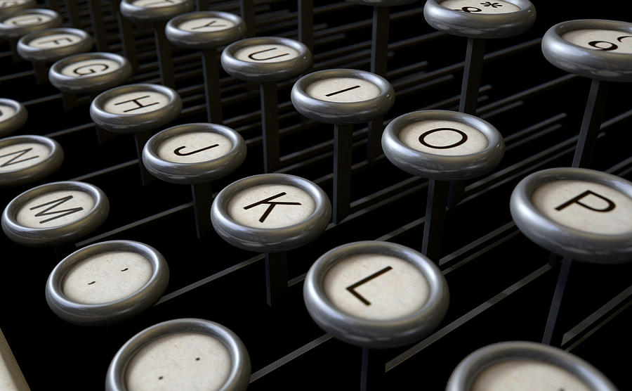
Sholes and Glidden tried bumping all the numbers to the top row, the vowels (including Y) on the next, and the consonants along the bottom two rows. When Remington’s mechanics got hold of the unit in 1873, they came up with a layout that is strikingly similar to the one we use today, but with the A and Z keys swapped, and the period where the R is today, while the R gets bumped to the far-right of the bottom row, like some typographical leper. By the time the final product was rolled out, that weirdness was fixed and the typewriter looked pretty much like this:
Because each letter sat upon a lever, they couldn’t be stacked one atop the other. This explains the staggered tilt of most keyboards today; the letters had to be laid out that way for those old typewriters, and it would have created an entirely new learning curve to structure successive keyboards differently. We’re all rooted to those dusty Sholes & Glidden units, some 140 years later.
A few tricks were woven into these old beasts in order to extend their capabilities; becoming a proficient typist meant more than increasing accuracy and word count – there were insider moves one had to learn. Like the fact that there were no keys for the numerals ‘0’ and ‘1’. An uppercase ‘O’ and a lowercase ‘L’ had to do the trick. The semicolon wasn’t there, as one could type a colon, hit backspace and punch a comma overtop the mark. Likewise, an exclamation mark could be made with an apostrophe punched over a period.
Since the backspace key was slow and cumbersome on early typewriters, manufacturers designed the carriage to only advance when the space bar was released. This created the trick of holding down the space bar to type the multiple characters needed for your ‘!’ and ‘;’ symbols. The ‘0’ made it onto keyboards early in the typewriter’s history, but many typewriters continued to omit the ‘1’ and ‘!’ right through the 1970’s.
The reason the QWERTY arrangement persisted into the 20th century was not because of technological need, but more because Remington knew how to build a good typewriter business. There were competing units that didn’t rely on jammable typebars, like Thomas Edison’s 1872 electric print-wheel device that would later form the guts of Teletype machines, or the 1893 Blickensderfer typewriter pictured above, which used a cylindrical type wheel. The Blickensderfer people had their home row read ‘DHIATENSOR’ because those ten letters could create 70% of all English words.
It’s actually a bit surprising that the Blickensderfer strategy didn’t take off. Their system utilized only 250 parts, compared to about 2500 in a standard Remington unit. This made their machines smaller and lighter than others. The company also developed the first electric typewriter in 1902. I can only assume it was a result of marketing and corporate might that allowed Remington to reign supreme, despite having what some might consider to be inferior technology. Maybe it was the name.
The QWERTY keyboard actually favors lefties – one of the only scraps of modern convenience which does. While the ideal typing rhythm involves both hands being put to work, there are thousands of English words that can be typed with only the left hand, but only around 200 that can be typed with only the right.
There are a number of international variants to the QWERTY unit. The Canadian Multilingual Standard keyboard has no caret (‘^’) over the ‘6’, but instead sticks the question mark up there. I have been typing in Canada for most of my 39 years, but have yet to ever make use of such a beast.
Many Central European countries use a QWERTZ layout, in which the Y and Z are swapped due to Z’s more prominent appearance in the German language. French speakers in Europe use the AZERTY layout, which not only swaps the Q and A, but also drops the M beside the L, designating the lower-right neighborhood as the keyboard’s punctuation ghetto.
Perhaps there’s a more intuitive way to sprawl these letters out for quicker typing. Maybe Mr. Blickensderfer had it right when he crammed the ten most popular letters onto the same row. But it’s not likely that old dogs can learn new typing tricks; we’ll probably be embracing QWERTY for generations, all because of those damn typebars.
