originally published December 6, 2012

How much do you really think about fonts?
Are you the type who launches each new typing endeavor in Callibri or Times New Roman because that’s the default your version of Microsoft Word shipped with? Do you revert to Arial / Helvetica because that’s your no-nonsense font standard? Or do you have your own preference?
I’m not a graphic designer. I understand only the basics of why some fonts play well with others on the printed page, and why some fonts look unprofessional and gimmicky. Personally, I type in Windsor Lt. It’s pretty, it’s quaint, and while I tell people I found it because it’s the font Woody Allen has used for the credits of all of his movies since 1977’s Annie Hall, it’s secretly because it’s also the font used in the opening credits of Who’s The Boss.
Unfortunately, the good people at WordPress, where this site is hosted, want my page to appear in this one font, whichever is attached to the design theme, either Palatino or Georgia. I have literally (or, literally, ‘virtually’) hundreds of highly-trained experts who operate the behind-the-scenes stuff here better than I ever could.
Let’s do a little font-digging:
I’ll admit it, once I figured out how to alter the default font in MS Word 97 from Times New Roman to something else, it was profoundly liberating. Don’t get me wrong – TNR is a delightful little font, but it was getting old. In actuality, the font is 81 years old.
British newspaper The Times commissioned a new serif font in 1931. Serifs are those funky little feet at the bottom of an ‘A’ or the little globby thing at the bottom of a lower-case ‘y’. Some fonts have ‘em, some don’t. Times employees Stanley Morison and Victor Lardent came up with the winning entry, no doubt after a lengthy night of Jamieson whiskey and uninhibited (yet intoxicatingly demure) London hookers.
If you have ever known the satisfying smack of one of these up against an unsuspecting leaf of paper, then you have dabbled in the world of Courier. Designed by Howard “Bud” Kettler in 1955 then redrawn by 1986 Gutenberg Prize of the City of Mainz winner Adrian “Also A Bud” Frutiger, this was the standard font used in the IBM Selectric series of typewriters. Kettler originally called the font ‘Messenger’, but decided that ‘Courier’ “radiates dignity, prestige, and stability.”
Courier (or, if you prefer, Courier New – the updated e-version of the font that was introduced with Windows 3.1) is font royalty. It’s the standard font of screenplays. Up until 2004, 12-point courier was the official typeface of the U.S. State Department. That’s the year it was changed to 14-point Times New Roman.
Friggin’ Bush just ruined everything.
Hermann Zapf was born in Germany, three days before the Armistice was signed to end World War I. He slapped on a swastika and fought for his country in the war that followed, but don’t hold that against his fonts. In 1977 Zapf picked out 360 little symbols and used them to create the Zaph Dingbat font. Now about that name…
…yeah, I have no idea. A dingbat is a printing term, referring to an ornament or character, often a trademark of the individual printer. Once the electronic era unleashed font collections into everyone’s homes, the term ‘dingbat’ came to represent any font that uses symbols instead of letters. This also allows me to make use of another All In The Family photo, because I can’t use ‘dingbat’ three times in a paragraph and not do so:
A quick check of Word 2010 reveals that Zapf Dingbats no longer has a place in Microsoft’s default dingbat bank (or, ‘dingbank’). Now we have Wingdings, a Microsoft creation from 1990. Whereas Zapf’s font has led a peaceful existence these past 35 years, Wingdings has run into some controversy. For example, this is the translation when you type ‘NYC’ using the Wingdings font:
Whoops. A tetch anti-Semitic. It took a matter of days for people to figure that out after the release of Windows 3.1 in 1992. Then there was the 9/11 conspiracy. The rumor: typing in Q33 NY (Q33 being the flight number of the first plane to hit the World Trade Center) would give you this awkward Wingdings combination:
Okay, that’s totally true, but it’s hardly a coincidence. None of the planes involved that day had Q33 in their flight number or tail number. Still, it’s a little creepy.
By the way, Herman Zapf is alive and well at 94 years of age. I thought that deserved a mention.
The only font to have earned its own feature film, Helvetica is one of the most widely used typefaces in the world. It’s simple, it’s clean, and it won’t make you look pretentious. Max Miedinger and Eduard Hoffmann concocted this font in Switzerland in 1957. To watch its progress as it oozed across the world, you can seriously check out Helvetica, a 2007 film entirely about the font. Unfortunately, it’s a documentary and not a bio-pic starring Gerard Butler.
You can’t get away from this font. If you’re sitting in front of McDonald’s, across the street form a Target inside your warm Jeep, wearing your American Apparel shirt, listening to your iPod and talking on your Motorola phone (with service from Verizon) about how you’d rather have a BMW, and hey, did you see that sale at J.C. Penney? If this applies to you, then you are literally ensconced in Helvetica. Hell, NASA printed that shit on the side of the space shuttle. That font is beloved.
And speaking of beloved…
No font has ever earned so much hatred. The above image isn’t just an image, it’s the basis for a website. A movement. One that has been going strong since 1999.
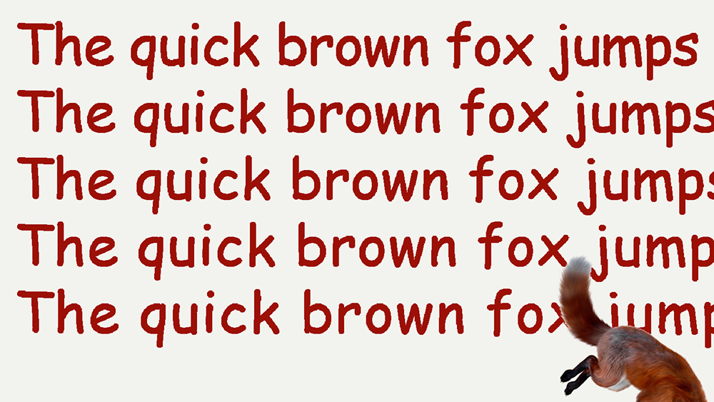
Confession: I used to write in Comic Sans. I have no specific reason to dislike the font, though I admit that any piece of printed work that makes use of it comes across as amateurish and dumb-looking. But that’s not what it’s for – it’s a casual font. It’s for use in the home, to be consumed with beer. This is a sweatpants font, not a blazer-and-tie font.
I think it’s time to free Comic Sans from its veil of shame. Microsoft designer Vincent Connare had comic books and kids in his heart when he developed the font for release with the Plus enhancement to Windows 95. He never meant it to be used carelessly. On a kid’s birthday invitation? Use it! Making a grocery list? Sure! Issuing a memo to inform your staff, informing them of upcoming cutbacks and possible layoffs? It won’t lighten the bad news, but it might anger someone enough that they’ll run screaming into traffic. Hey! That’s one less layoff!
There’s always an up-side.

TY! that’s a great posting about Typography. However, since there never was a thing like a creative Microsoft product it’s impossible that Vincent Connare created the font. Even when WIRED Magazine credited him as designer, he only came up with the digital version and name. Only a few Typographers know the original designer of Comic Sans…
PS: Herman would appreciate it if you could replace the “h” in his surname 😉
LikeLike