originally published October 16, 2012
Is it a sign of my maturity that my taste in art has evolved? I now see beauty in the great masters, and find myself moved by the color and composition of inventive modernity. But there was a time in my life when great art was defined by whether or not it made me say, “…dude!” when I was really, really high.
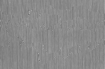
I didn’t know to call it at the time, but I was apparently a big fan of Op Art.
Op Art makes use of optical illusions. In layman’s terms, it’s art that looks like something else, like it’s moving or warping or in some way blowing the mind of your eyeballs. In fancy terms, it dissects the interaction between illusion and the picture plane, erasing the aesthetic division between seeing and understanding and blah blah blah.
(“You see? The lines blend, creating the appearance of multiple colors on multiple planes in an elaborate mural when in fact it’s just a painting of my balls.”)
This is trip-out art. Art that can intoxicate the mind free of chemicals. It originated where a lot of the great mind-melting art of the past century was born, in Germany. Like many monumental German leaps in art, it was also quashed when the Nazis rose to power and closed the Bauhaus school. It was here that huge steps were being taken in the constructivist realm – art with a social purpose.
Once the goose-steppers had stomped upon the German art scene, many Bauhaus instructors fled to America and set up shop. While the term ‘Op Art’ wouldn’t show up until 1964, the early masters of the style were already setting up the foundation for future dorm-room décor as early as 1938.
Time Magazine is responsible for the name, describing a Julian Stanczak show at the Martha Jackson gallery in New York. I’m not entirely sure which of Stranczak’s pieces were on display for that show, but it’s clear that his work is rooted deeply in colors and images that aim to boil your eye juice:
Many of the artists who fell into the Op Art category resented the name. They saw what they did as ‘perceptual art’, which I suppose sounds more thought-provoking and less like something you’d buy at the same store that’ll sell you a USS Enterprise bong.
I’m going to show off some of the Op Art that used to move me. I think you’ll agree that this is one of the most fun art forms, and also the one most likely to make your brain fall down and hurt itself.
This piece is by Victor Vasarely, the guy who painted Funky Zebras up above. I’m not certain of the context – I’m sure it’s on some museum or art gallery grounds over in Pécs, Hungary, but I’d like to think they just plunked this down in a park somewhere and watched for people’s reactions. I call this one “Floating Cubes! Oh No! Other Floating Cubes!” (I prefer inventing my own titles for great art. It makes me feel like I have a personal connection with it)
This piece is one of my favorites by Op Artist Richard Anuszkiewicz, who was notable for being one of the foremost creative minds in his field, as well as the fact that the first four letters of his last name are ‘Anus’. Also, I could point out that his first name could be abbreviated to ‘Dick’, but I refuse to debase this article any further.
The piece above, which I call “Potential Fanta Ad Background” is a brilliant use of white lines on an orange background, particularly laid out to create the illusion of expanding boxes. I love expanding boxes.
This one comes from English artist Bridget Riley. I call this one “Bad Floor Design Idea”. Of all the Op Art I have skimmed through, Riley’s work is perhaps the most disorienting. In the Op Art world, this is high praise.
One sentence in her biography puzzles me: “Her paintings have, since 1961, been executed by assistants from her own endlessly edited studies.” So she comes up with the ideas then gets uncredited assistants to do the dirty work? Well done, Ms. Riley. I wish I could get away with that. I’d call up my assistant with something like, “I need an article about bacon and astrology!” and it’d get done. Oh, the rewards of success.
Josef Albers is one of the early risers to the Op Art movement. Born in Germany and eventually a professor at Yale, he taught both Stanczak and Anuszkiewicz about the interactions of colors. There are three particular interactions he felt artists should concern themselves with:
- Simultaneous Contrast, where one area of color is surrounded by an area of a different color. This enhances the difference in brightness and tint, and really makes the colors pop.
- Successive Contrast is where the viewer sees one color then another by shifting the eye’s fixation. You have to know how to mess with your audience a bit for this one.
- Reverse Contrast is when white or black (or even a color) might seem to spread into neighboring regions. This can make different areas within a piece appear more alike – kind of the opposite of Simultaneous Contrast.
I’m not sure which of the above contrasts were used in Albers’ “Ten Mix Tapes”, the piece above, but I’m sure if he was still alive he could tell us.
Omar Rayo from Colombia created a number of works which I feel fit into the “Psychedeliorigami” sub-genre of Op Art. Rayo had to start his own art museum in Colombia because the government had no interest in supporting his work.
This isn’t one of Ludwig Wilding’s Op Art works, but it’s the piece I felt needed to be shared here. Yes, that’s the little girl from that famous Vietnam napalm photo, being escorted from her horror by Ronald McDonald and Mickey Mouse. If the artist’s message is lost on you, perhaps he simply needs a bigger sledgehammer.
Michael Kidner, whose work here I have titled “So Obviously Boobs”, is one of my favorites from the Op Art world, really blending colors together masterfully until my eyeballs hurt.
Over the past several years I’ve spent what might be deemed an unhealthy amount of time skimming across the surface of the Internet, looking at what can only be described as ‘stuff’. Optical illusions and eye tricks pop up all over the place, which can make Op Art seem distilled and as unnecessary as Kitten Photo Art (which will not merit a kilograph from me, ever). But good quality Op Art is everything we’ve been told art is supposed to be: it challenges the eye, the brain, and everything in between (which I assume is just a bunch of fluid). It may not deliver a jab to the emotional solar plexus of the soul – or it may, why not? – but it has a function and a purpose.
And it looks great on the wall behind my USS Enterprise bong.
